Connections
Published under Design.
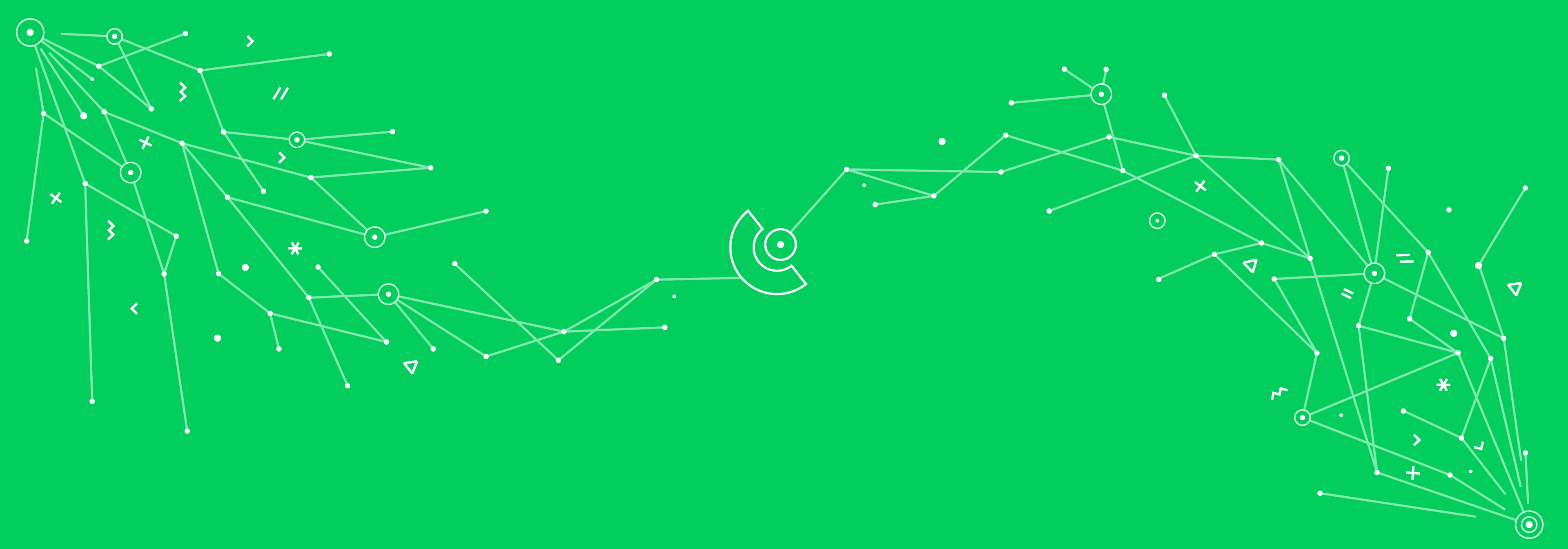
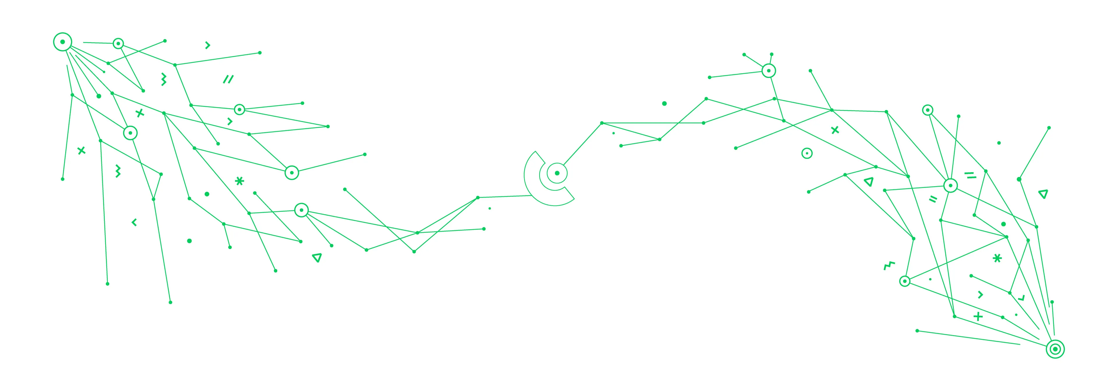
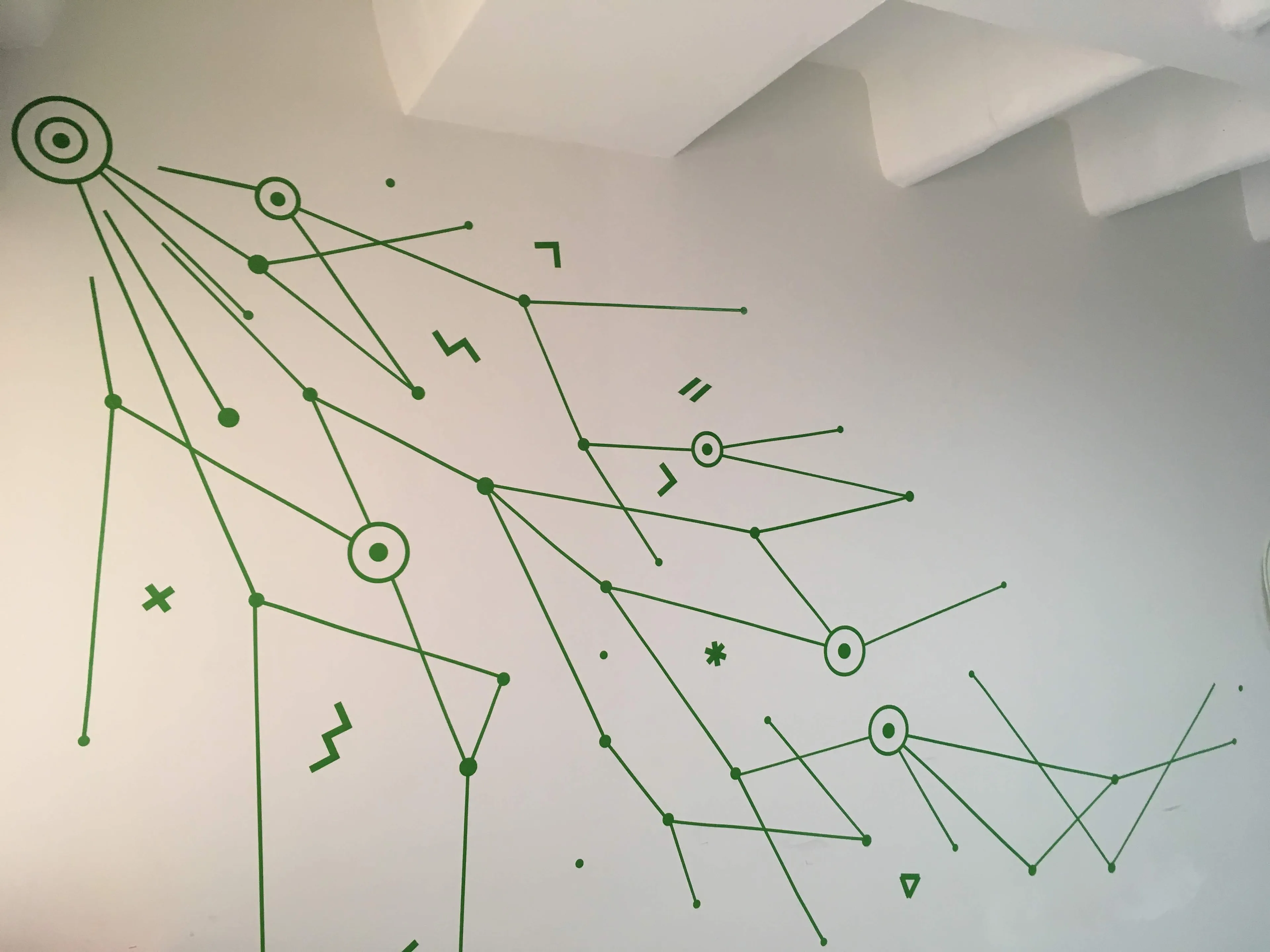
A mural made of simple lines and circles as a representation of the sales and marketing process as it propagates and spreads out looking for connections. Any similarities with the concept of human interactions is not just a coincidence... any similarities with fish ARE a coincidence.
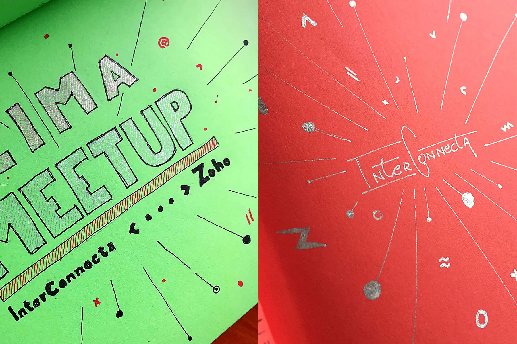
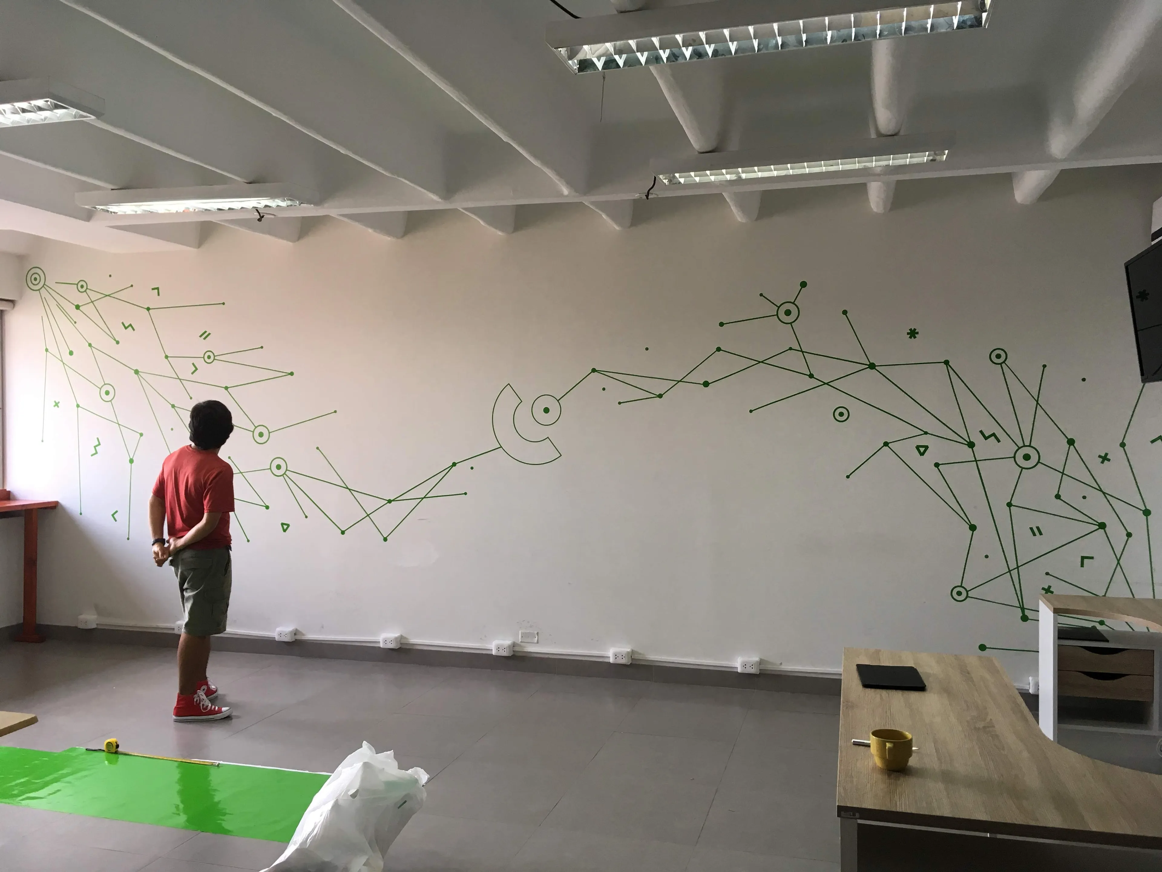
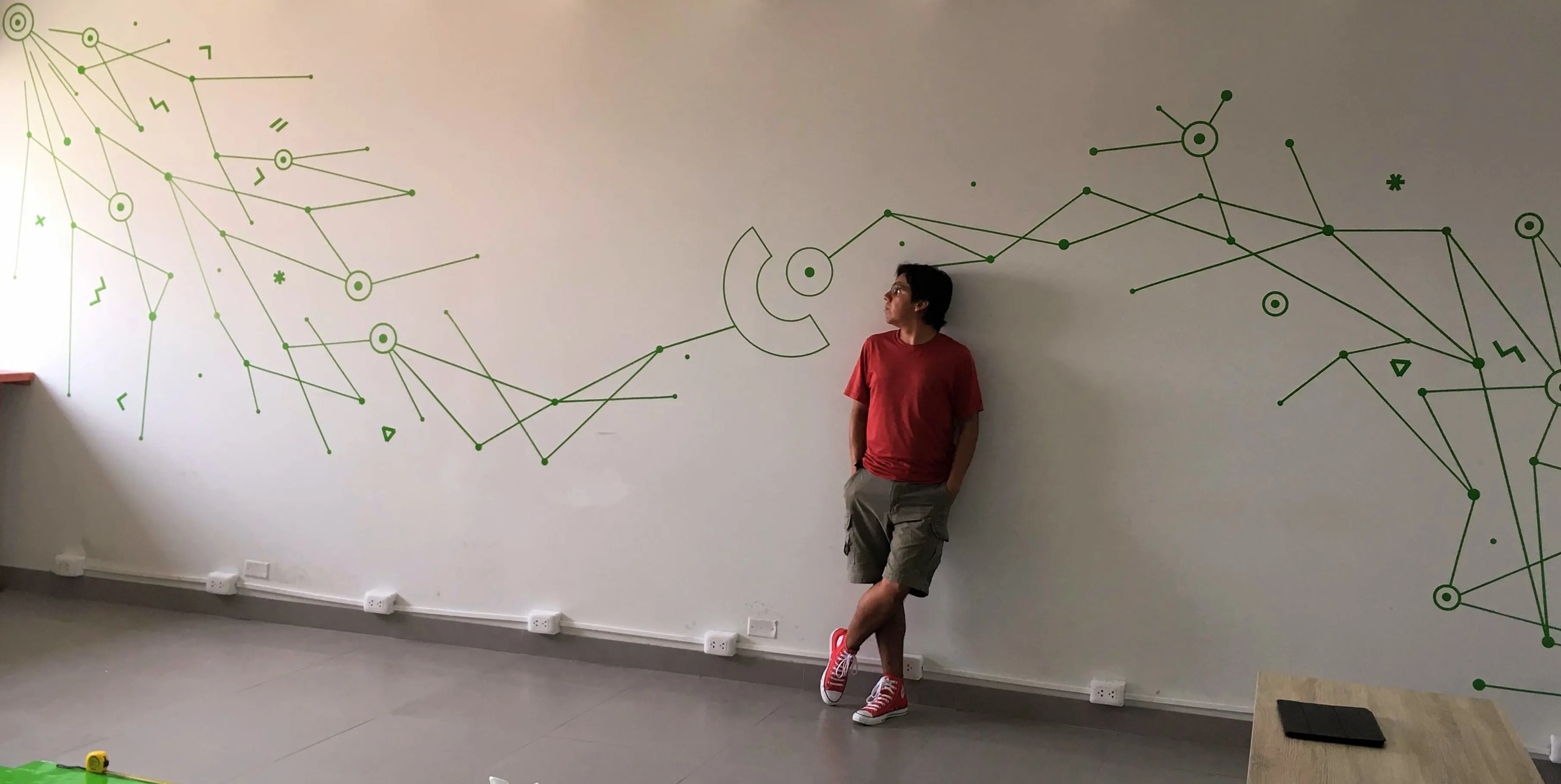
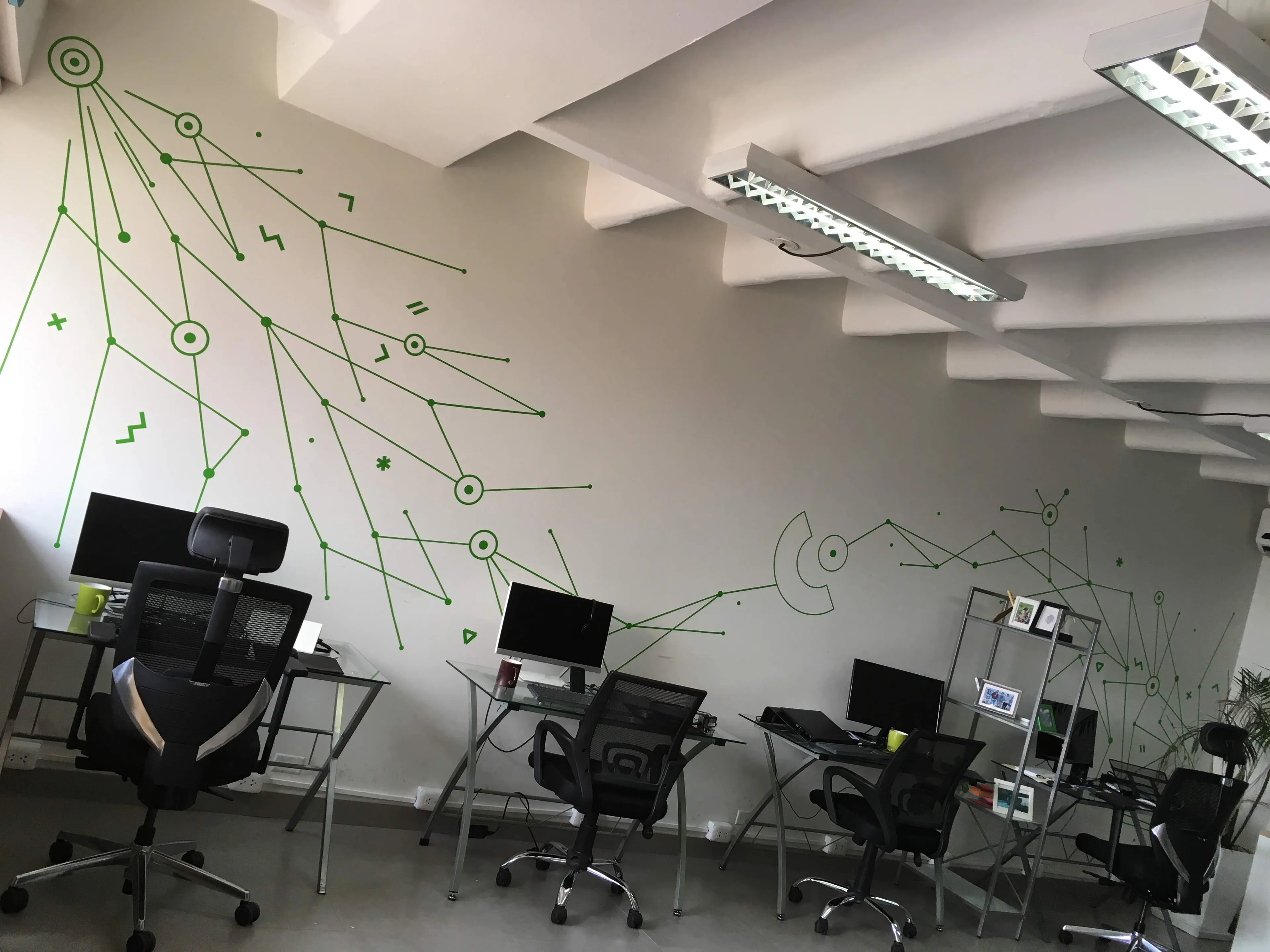
While working at InterConnecta, there came a time to redecorate the new office space. We agreed that we wanted the overall style of node graphics which had already been used in our designs. When printing the entire mural as a single piece was no longer an option due to cost, a funny question came up... If it's all just lines and dots, can we print them, cut them and build it?
So I took on the challenge of conceptualizing, designing, and making the “mural” utilizing basic shapes and putting them together in a way that was hopefully easy on the eye.
Design
The design started from simple sketches I had done earlier of explosions spewing all kinds of ideas and nonsense. Much like the feeling you get when you have a new project to work on. So exciting...
Thinking of the canvas available, this would evolve into two explosions colliding and meeting at the middle... connecting in a way. And so the idea would evolve and reveal itself to be much more than just random explosions or carelessly placed nodes.
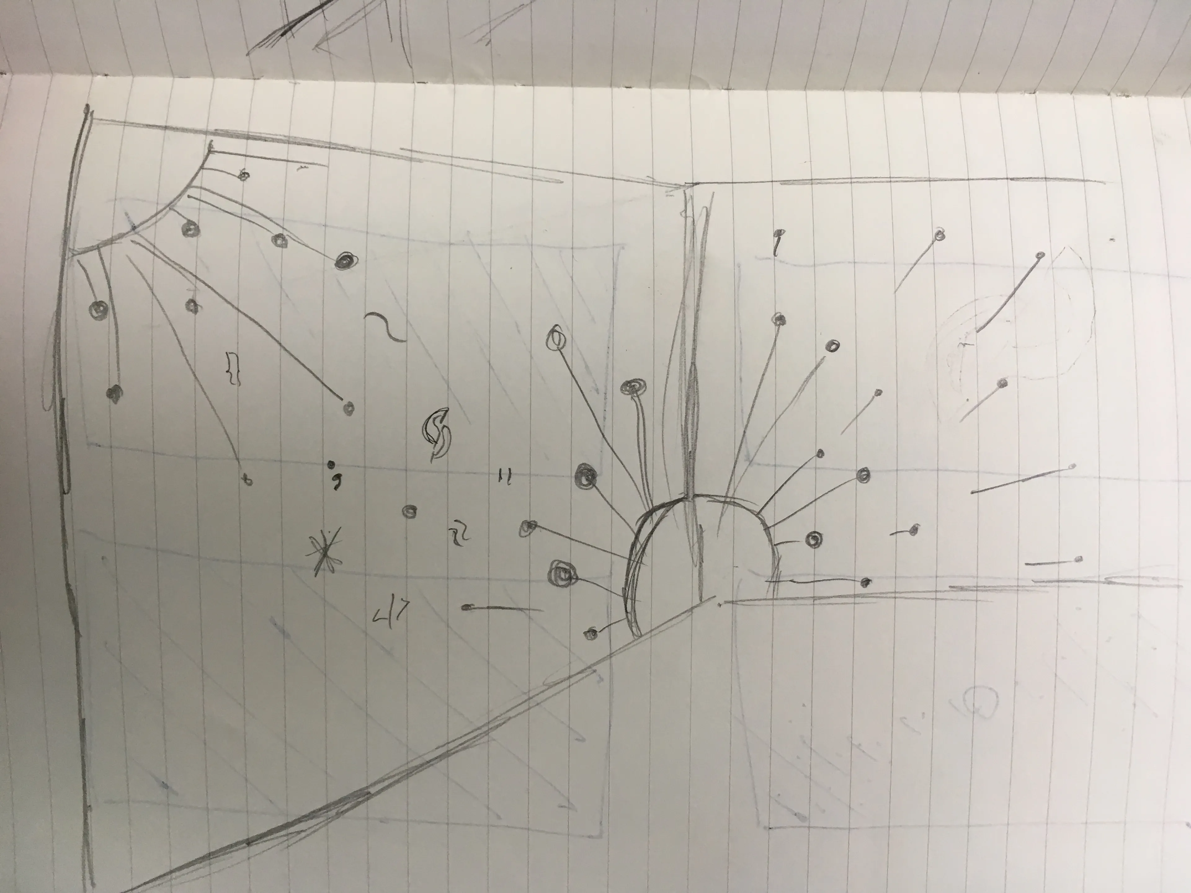
I would move the project to a digital medium using Paper to finilize the concept. The explosions were in fact entities trying to connect with one another. Giving away all they could in big bangs for that one chance to connect.
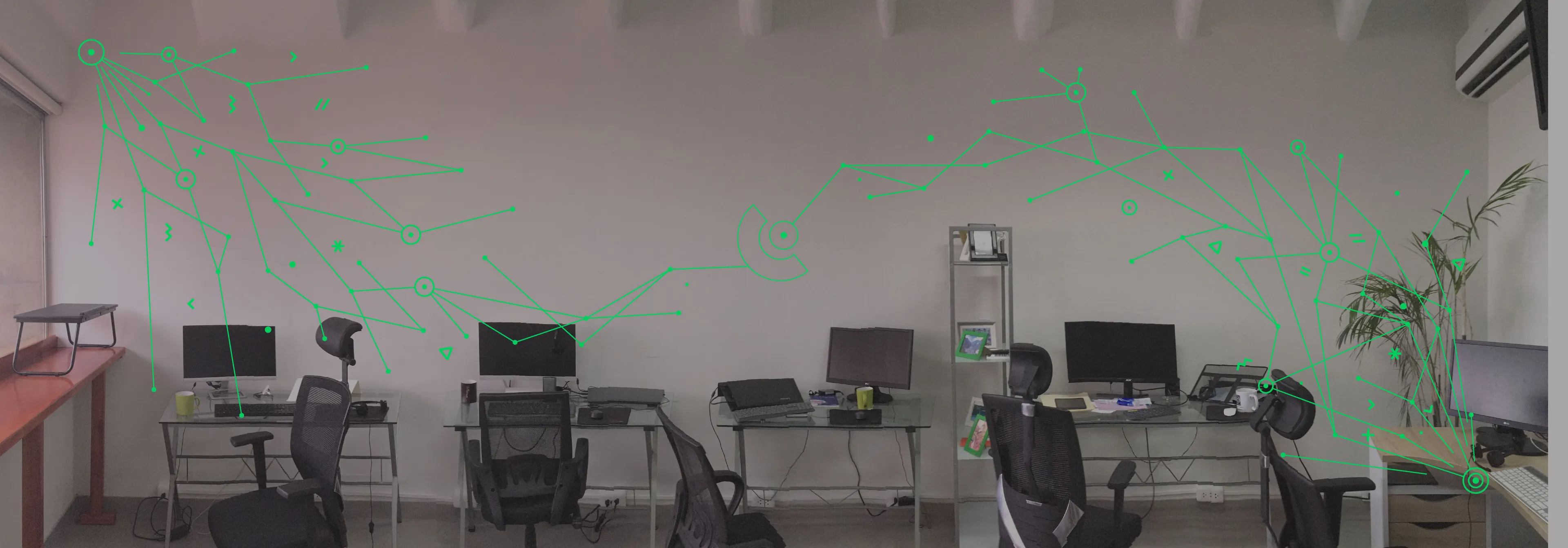
Once completed, the sketch was layered over a photo of the office to take into consideration what the space would look like with furniture and make sure it was strong enough to come through.
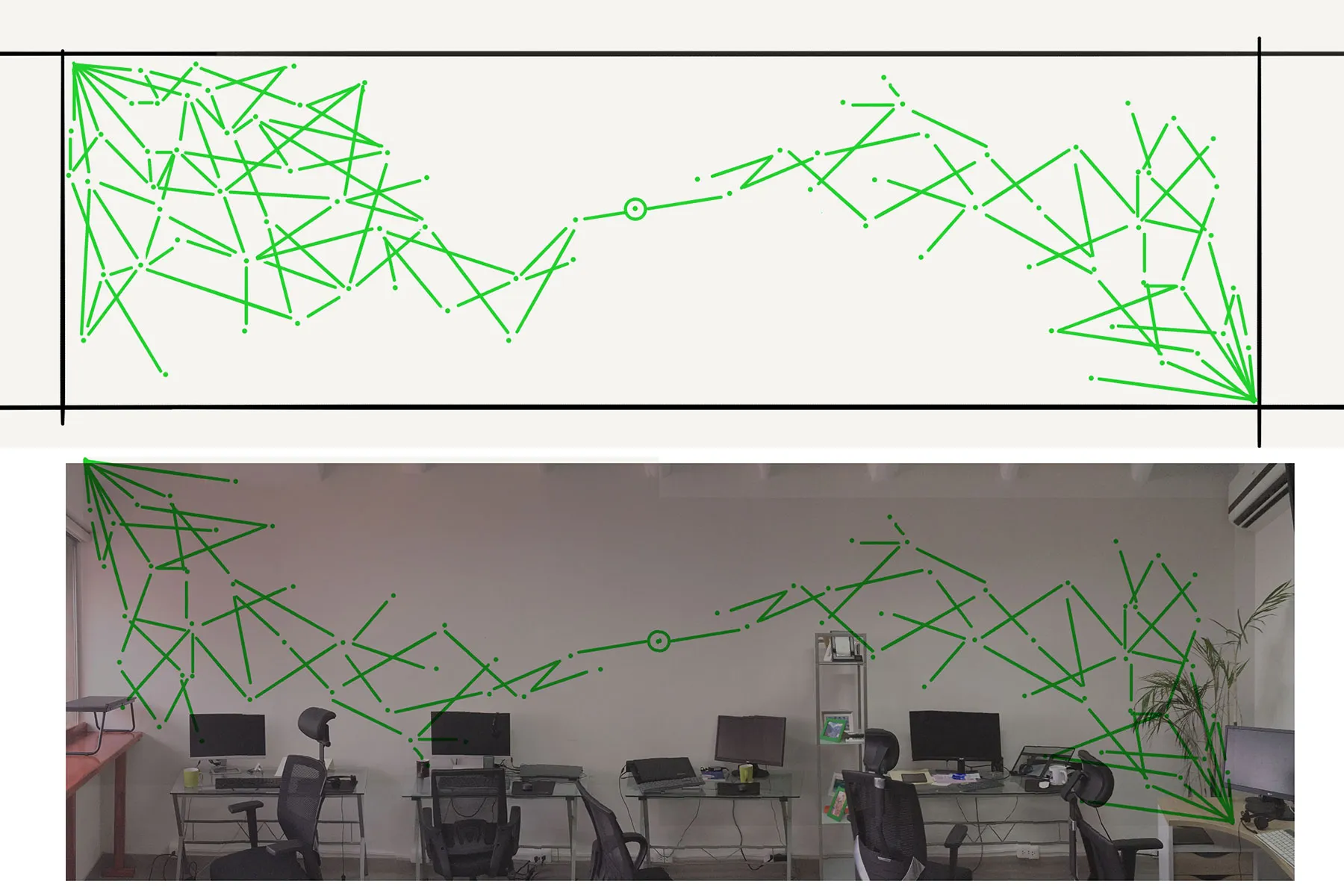
Once I was sure the sketch was in the right place, I proceeded to finalize the design in Adobe Illustrator and adding a few additional elements. The end result would be these two explosions located at opposite corners of the wall spreading through nodes and branches that seemed to flow towards a single point.
Guides Placement
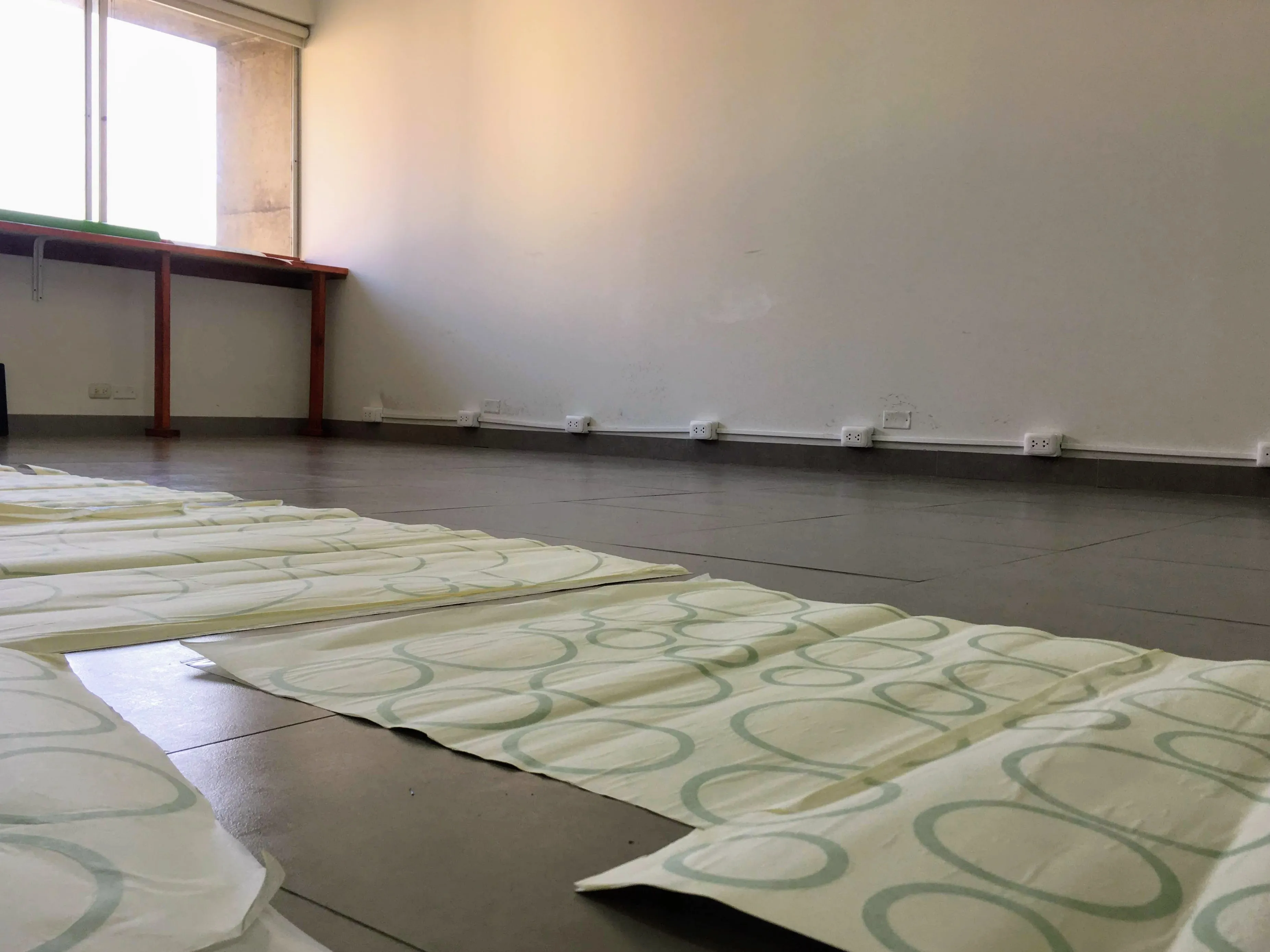
With the design finalized, the next challenge was to prepare the materials and the canvas. While we had receied the circles and lines cut up. The lines were actually twice as wide as needed them to be so I painstakingly spent the evening prior, to beginning the work, cutting up the strips into two.
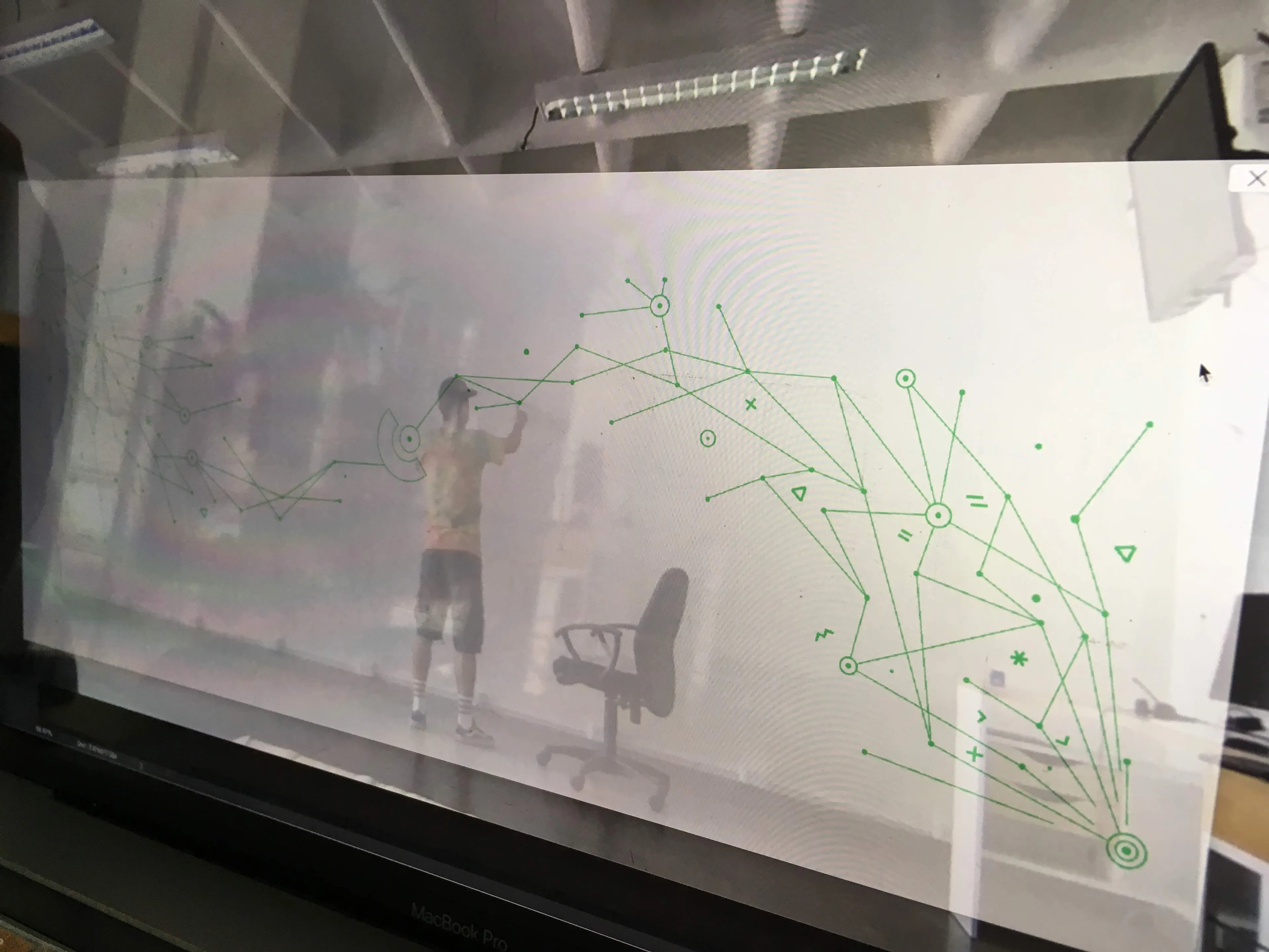
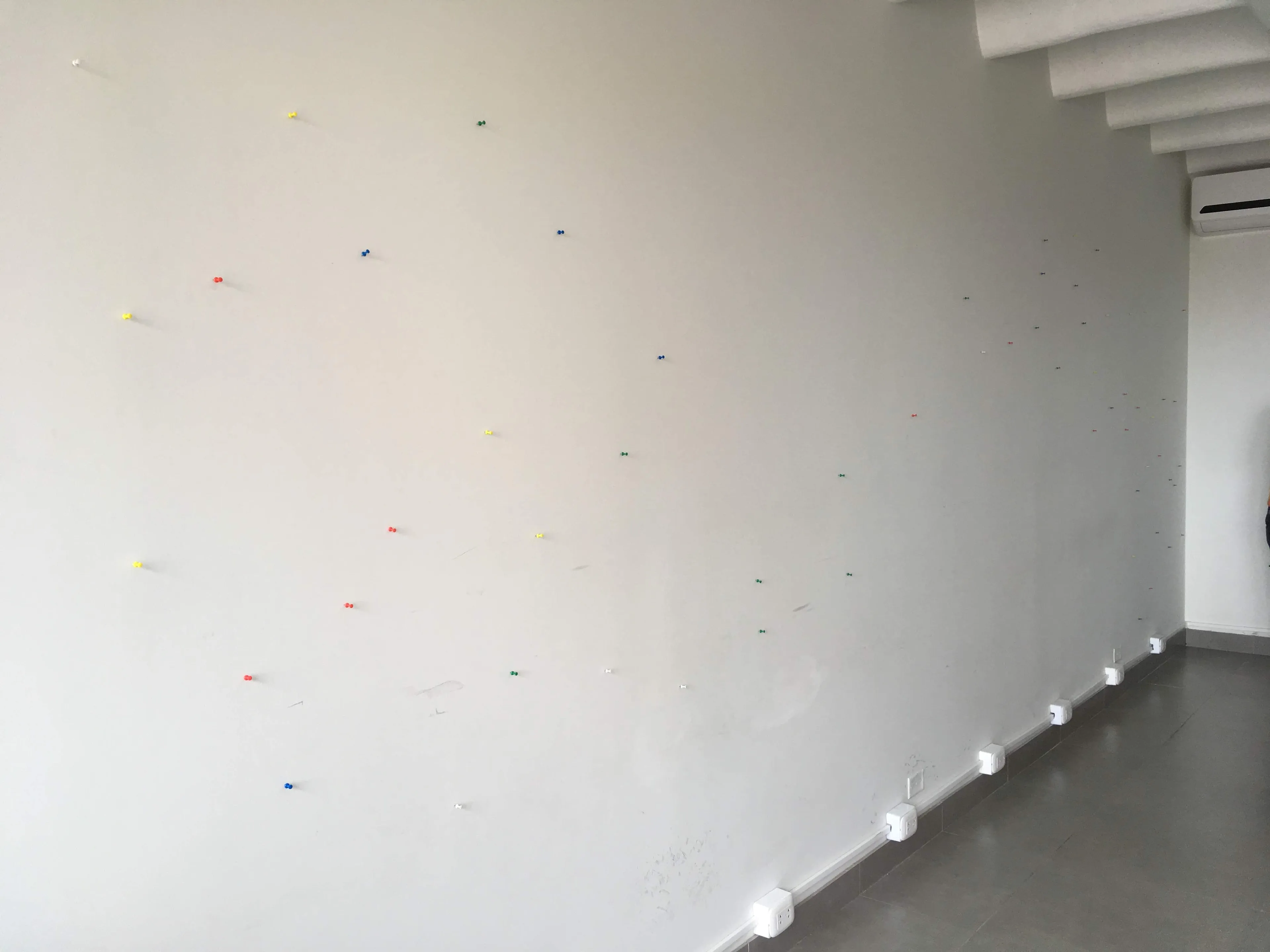
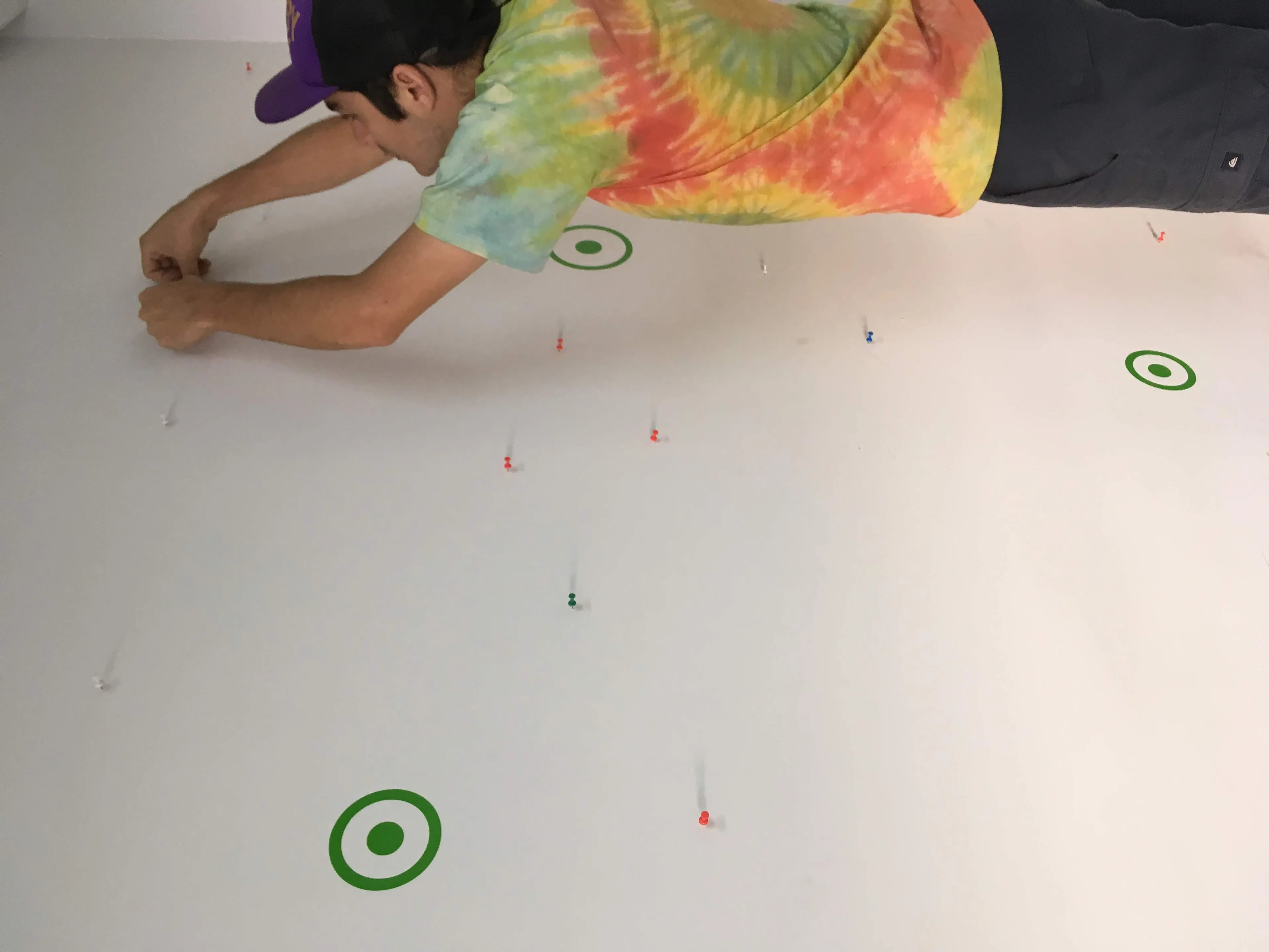
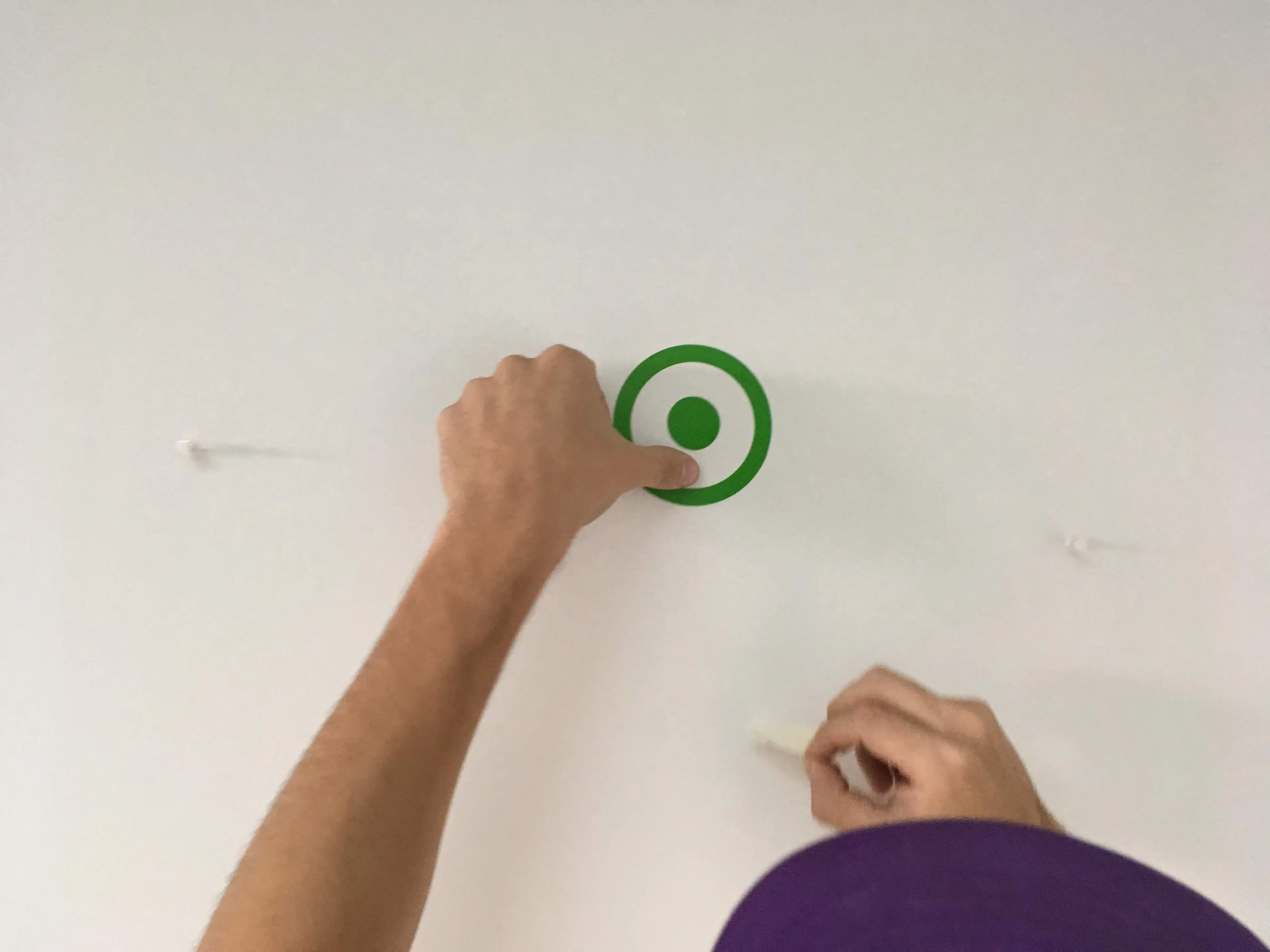
The morning of the work I would empty the office and locate a camera and a laptop across the room. I used Overlay to place the design on top of the live stream and with the help of a dear friend, Omar, we started placing pins on the wall as guides for the dots and lines.
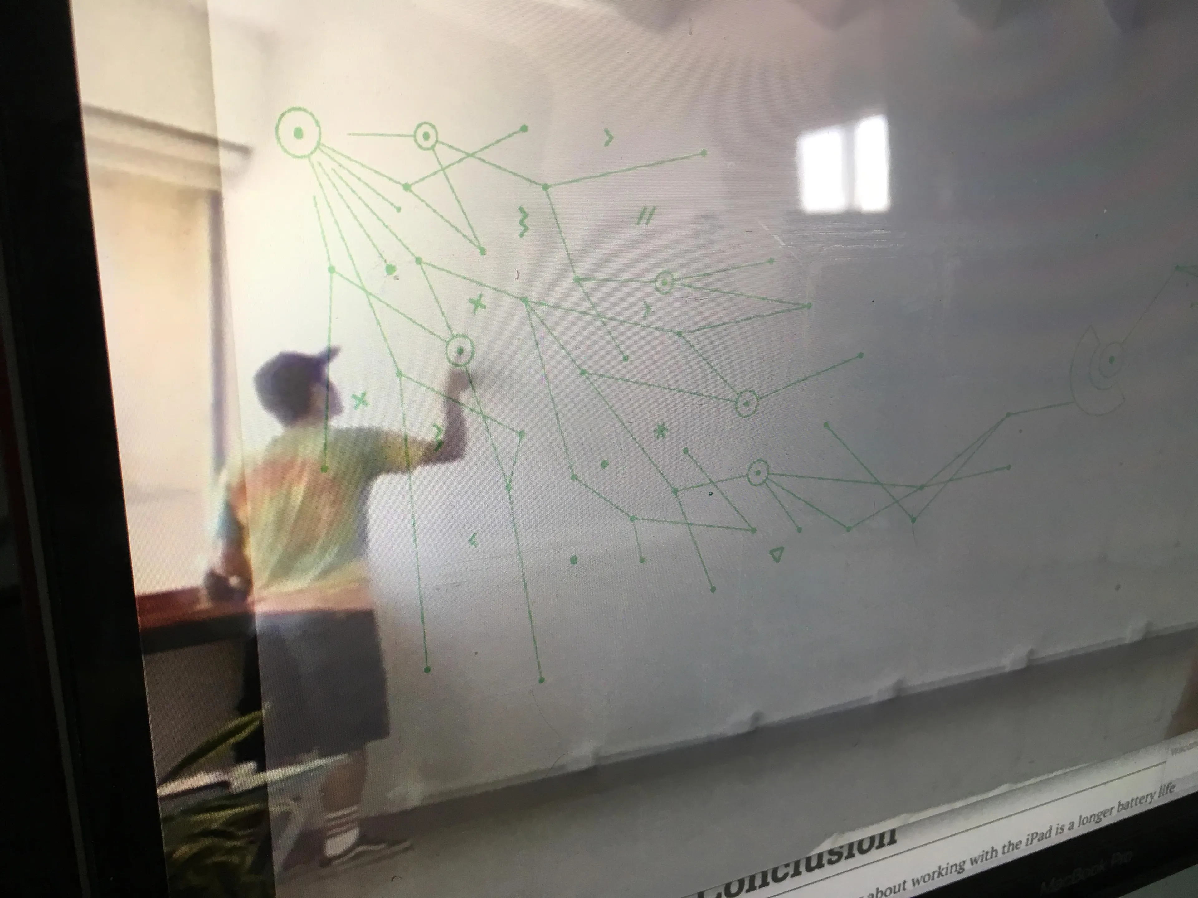
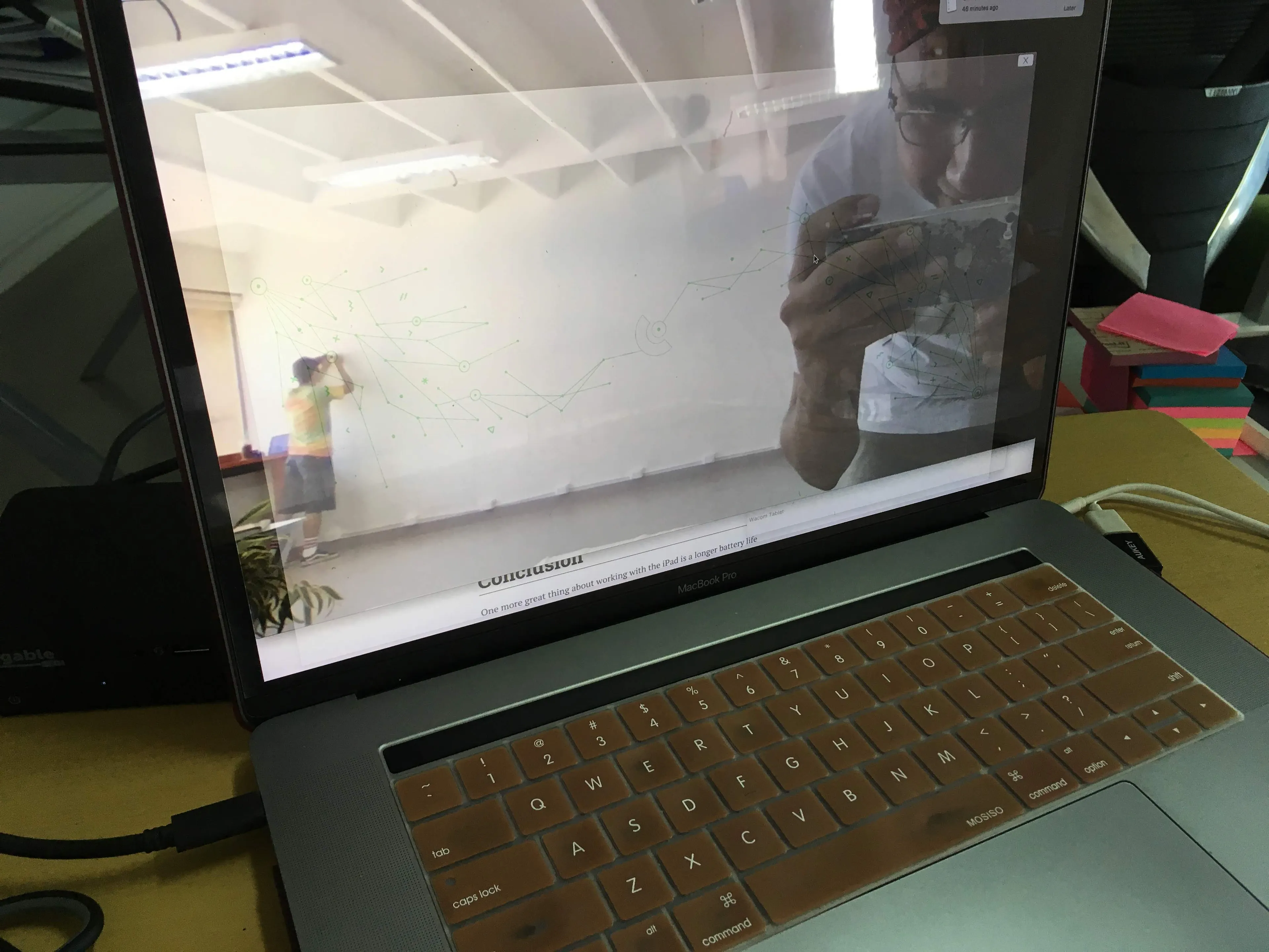
One of us would go to the wall with a copy of the graphic, point, and wait for feedback from the other as to whether they should move further to the left, right, up or down. Overall this was a blast and eventually we started getting the flow and working faster through the process. As we moved towards the corners we'd find that I had not taken into consideration lens distortion and that our perception of where some of the points should be according to the graphic were not actually where they should've been. This distortion would not be detrimental to the finished work —there would be final "by eye" adjustments as we moved on— but it was interesting to its development.
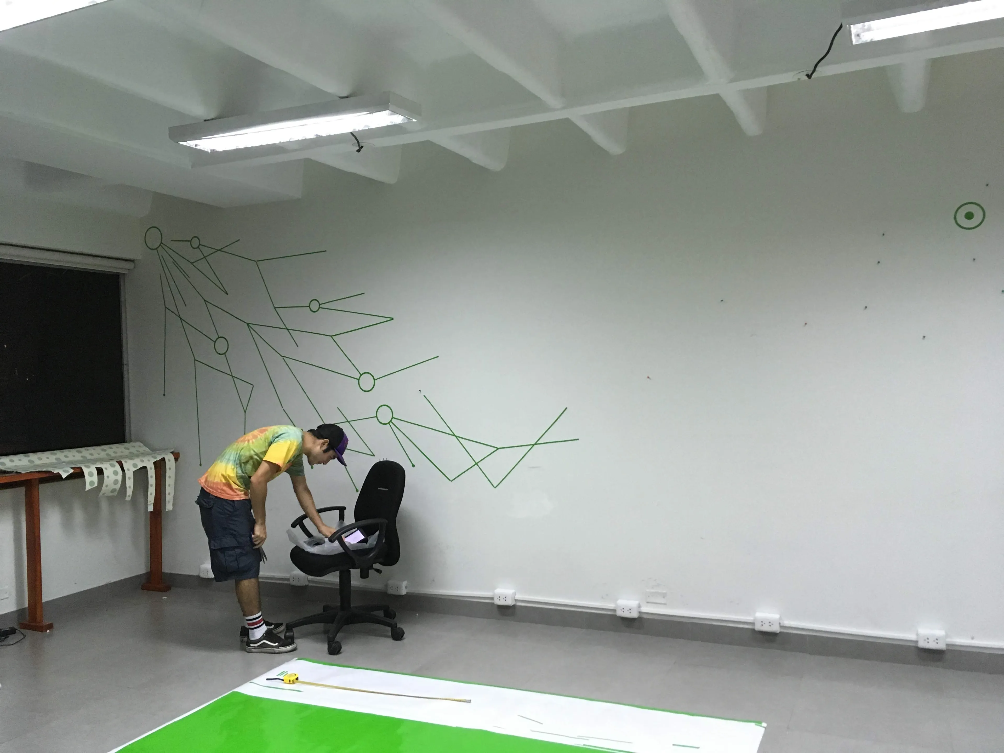
At the end we'd be left with a wall full of pins and the entire leg work ahead of us...
Execution
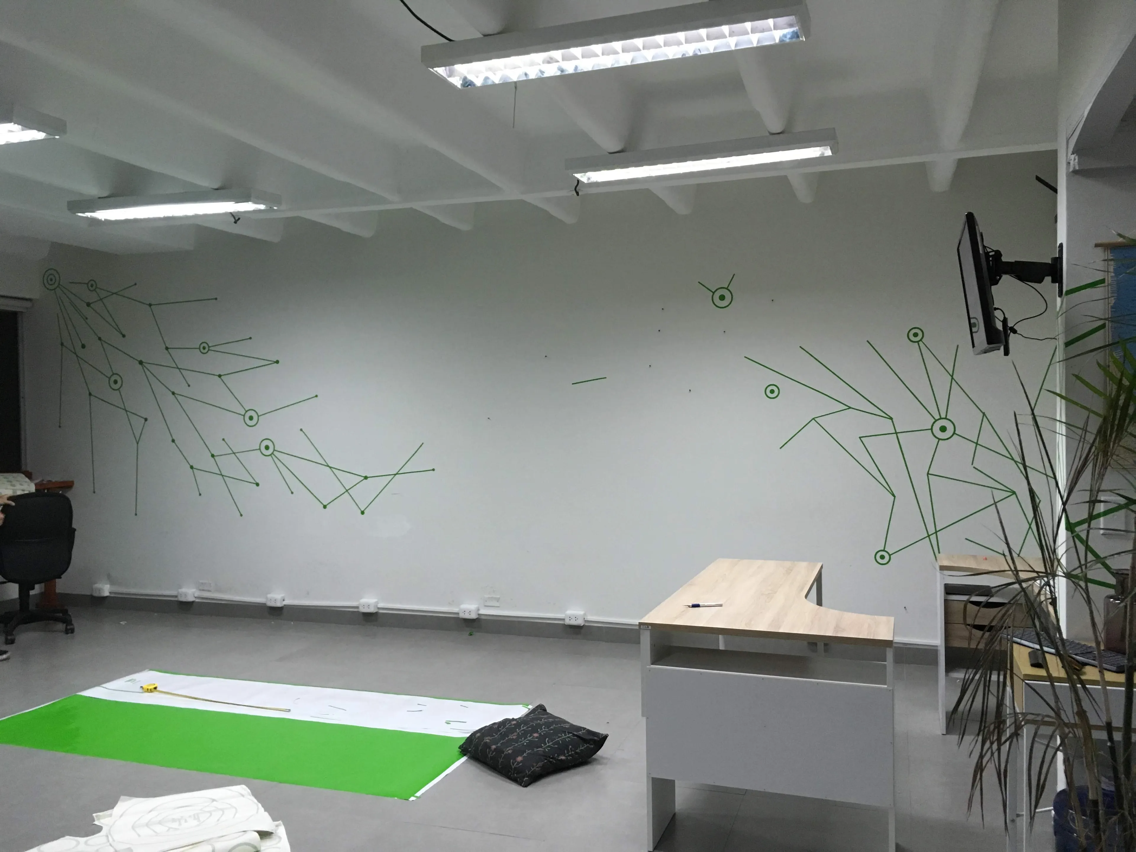
We started by replacing first the circles and dots as these would make it easier to find our way throughout the mural.
As we progressed, the mural started to take shape and these fish like shapes became more and more obvious, they actually gave a sense of fluidity to the overall work. At the end, all we'd be left with was with unraveling the center piece which resembled elements of the InterConnecta logo.
Completion
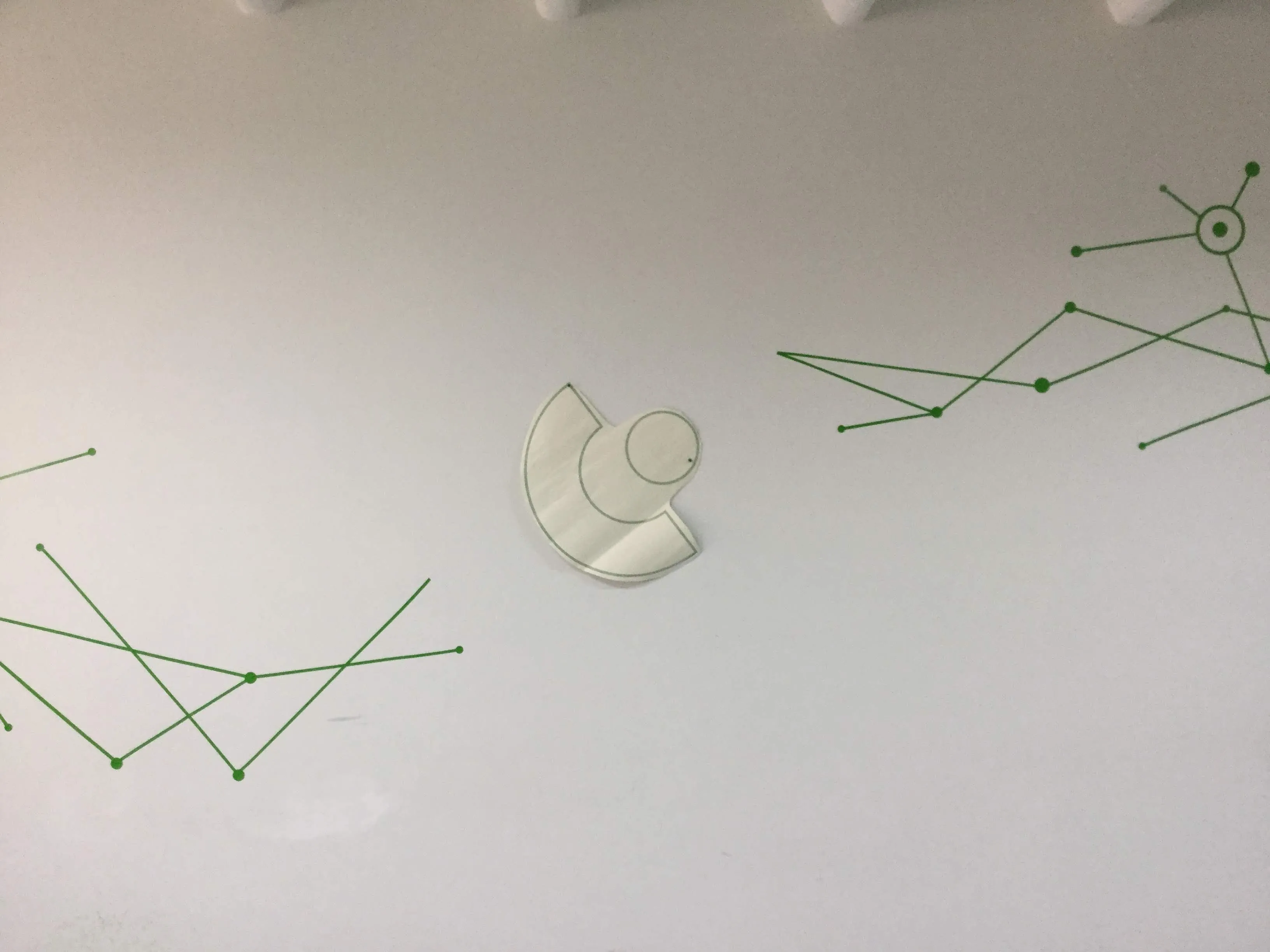
The completion of the work came with the addition of the extra design elements, crosses, lightnings, asterisks, and more. These would help fill in the blanks and help bring back the original sense of an explosion.
Much like the marketing campaigns we'd run for customers or the systems we'd build using APIs to send data back and forth... These explosions would simply require of a single point to create a spark.
To me this ended up becoming a reflection of life itself, a series of connections that spread over a large canvas. Ourselves as seemingly random entities trying to reach for something, searching for connection.